Colour is a critical element of branding, but has it ever been more evident than in the images below?
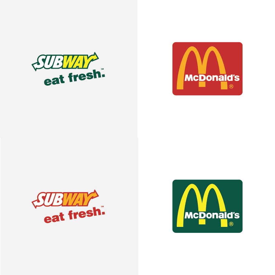
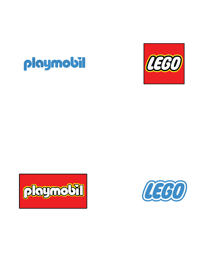
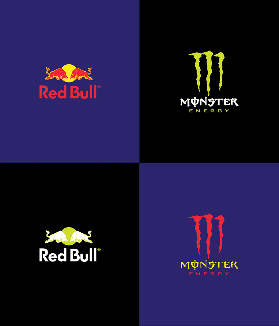
Printsome.com Chief Designer Paula Rúpolo put together some simple GIFs that swapped the colour of famous logos with those of a competitor right before your eyes.
Devoid of its golden tinge, the iconic McDonald’s M no longer conjures fantasies of the restaurants fries. In comparison Subway’s ‘eat fresh’ tagline suddenly reads like a lie.
It’s a special brand that can be confident an entirely black logo is going to be a successful one, but if anyone makes it work, it’s Apple. With Microsoft’s palette it looks just as good, though the all black Microsoft logo makes me feel like I’m peering into the void.
With Lego, one of the most appealing aspects is how the shapes the colour forms inspire images of the blocks themselves. Playmobil…well, it’s pretty poor.
I don’t know about you, but I feel this one effectively summarises the way I feel when reminded that Yahoo! still exists.
This may just be my favourite of the lot. The switch defines what makes both designs so great. Red Bull’s palette also looks good on its competitor, but certainly helps to distinguish its complexity. Monster’s look, on the other hand, is both striking and simple. Applied to the Red Bull design, the white and green is entirely unattractive.
You can see more of Rúpolo’s swaps, and hear her thoughts on the change, here and here.


