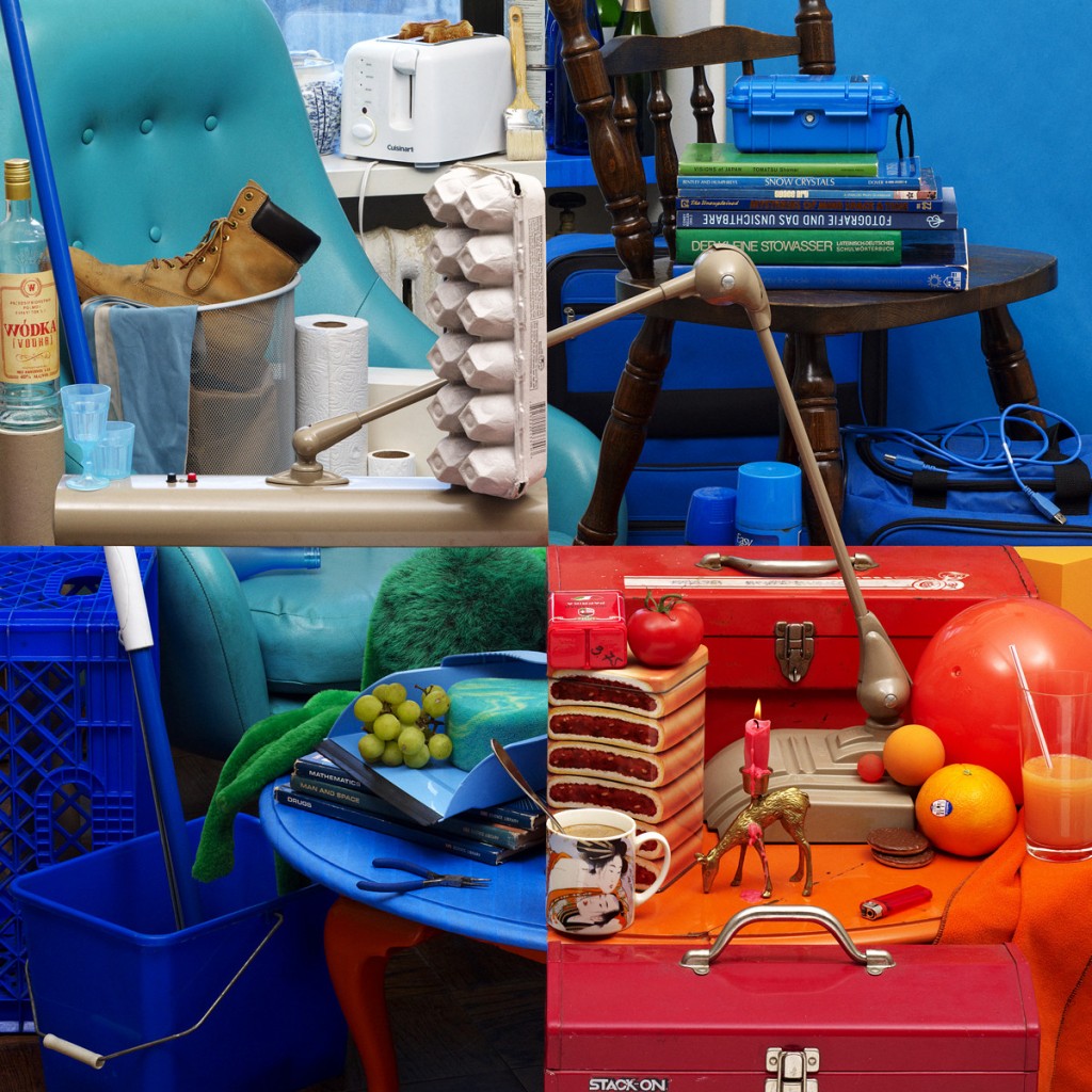
In 2013, New York-based photographer Bela Borsodi was hired to create the cover art for contemporary band VLP‘s new album, Terrain.
At first, it appears to be a composition of four separate images, but when you look closer, the truth is revealed:
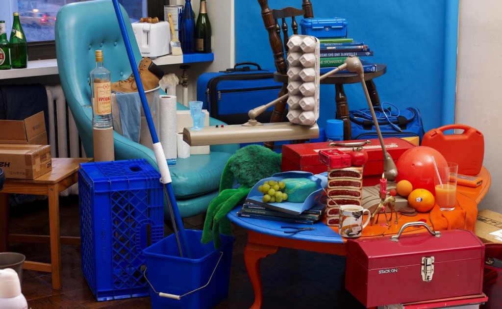
It is all one image.
Don’t believe me? Here it is again, on a different angle.
Artists often avoid having rigidly defined lines in their shot because they give the perspective of a broken frame, and Borsodi uses this to his advantage. Combined with some clever item placement (the full extent of which you can see in the video below), it’s clear to see how easy it is for our mind to misconstrue the truth.
To see more of Bela Borsodi’s work, visit his official website.


