A great logo tells a story. Some are obvious, some not. Others still are just plain ridiculous.
Below is a brief collection of our favourite logos that, when looked at it in just the right way, reveal a hidden meaning. It’s a celebration of brands that go to extra lengths to define themselves, even if the customers don’t immediately realise it.
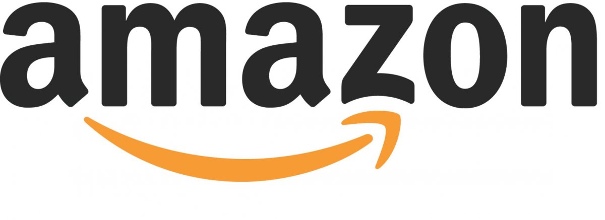
Designer: Turner Duckworth.
Amazon’s iconic orange arrow represents two elements the company prides itself on. The first, and perhaps most obvious, is the representation of Amazon’s comprehensive catalogue. Notice how the arrow goes from a to z, indicating that customers can find whatever they want on the website.
The second element is Amazon’s drive to put a smile on every customer’s face. Notice how the curve in the arrow looks like a smile, with its head in the shape of a dimple.
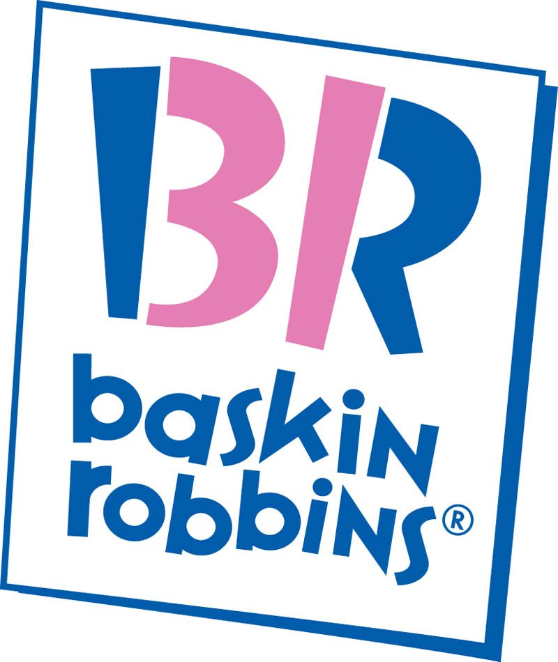
Designer: Ogilvy & Mather.
Have you ever realised that the use of colour in the Baskin Robbins logo reveals the amount of signature flavours the brand offers?
The idea to offer 31 flavours was initially recommended by Carson-Roberts, the agency that would later become Ogilvy & Mather.
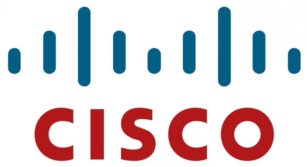
Designer: In house.
The bar’s on IT company Cisco’s logo represent electromagnetic waves, and are positioned to mirror the shape of San Francisco’s Golden Gate bridge.
Interestingly, Cisco is actually based in San Jose.
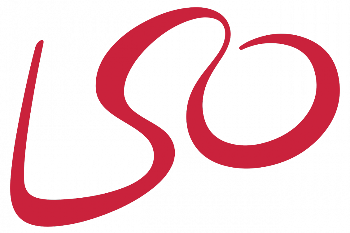
Designer: The Partners.
The London Symphony Orchestra logo is an anagram, and shaped like a stylised conductor.
Designer: Timothy Hanley.
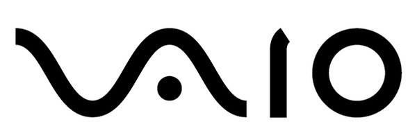
Sony’s former computer brand, Vaio’s logo depicts the amalgamation of analogue and digital technology. The ‘Va’ portion is an analogue waveform, while the ‘io’ represents binary code.
Designer: In house.
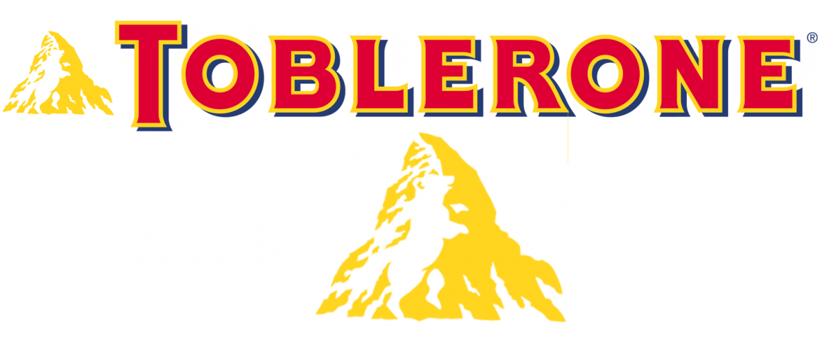
Have you ever noticed the bear in the Toblerone logo before? The ‘dancing bear’ is a reference to the Swiss town Bern, known as The City of the Bears, where the chocolate originates from.
Designer: In house.
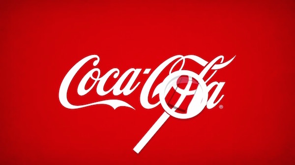
Finally, and perhaps most interestingly, here is an example of what may be the only accidental hidden meaning in a logo.
In 2013, McCann Copenhagen launched a campaign highlighting the existence of a Danish flag in the brand’s image. It paired well with Coca Cola’s positioning as a source of happiness for consumers; that same year, the United Nations had named Denmark ‘the happiest country in the world’.
You can see even more logos with hidden meanings over at Business Insider.