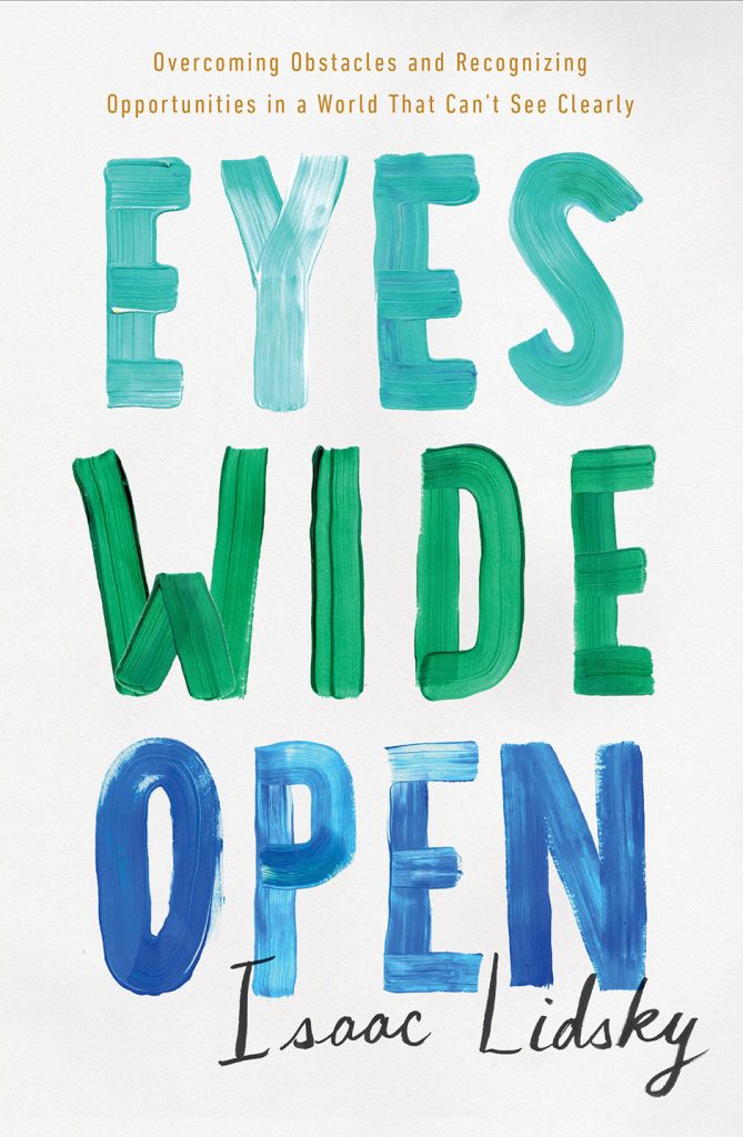
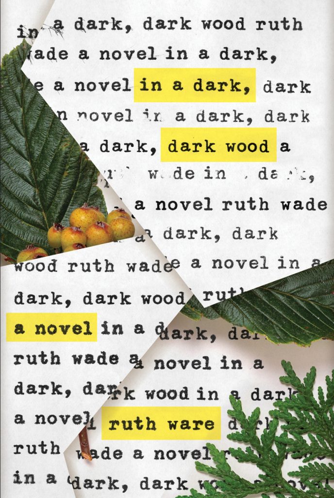
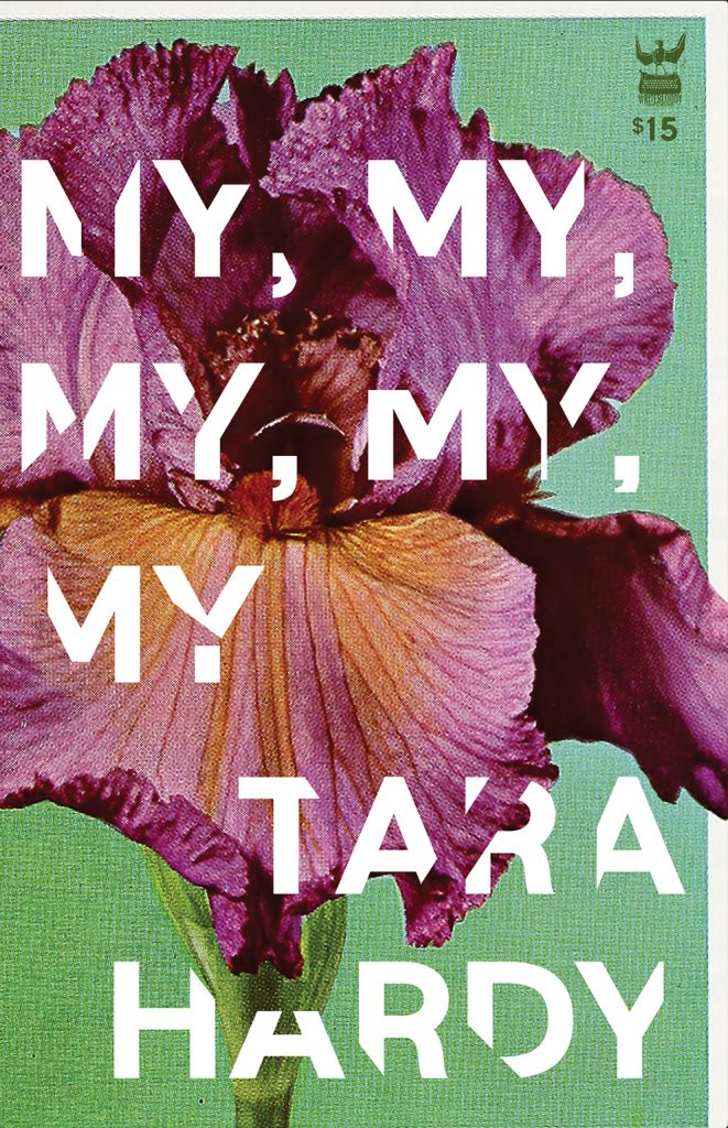
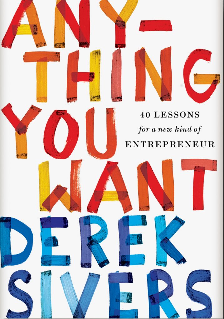
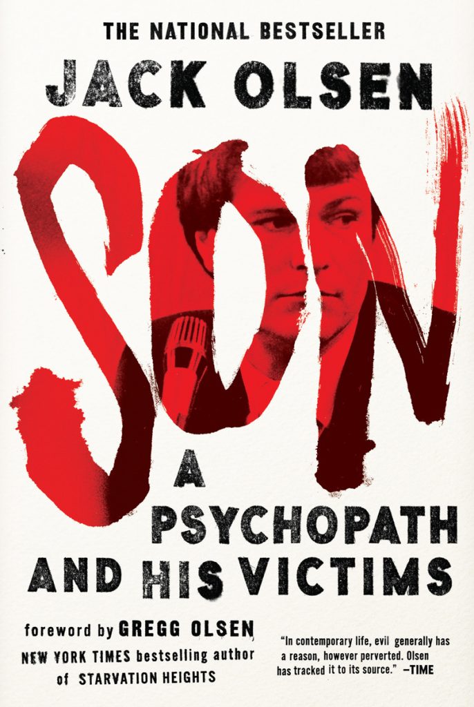
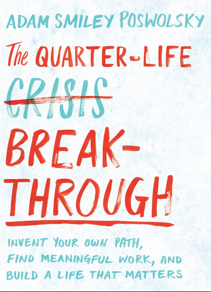
“Don’t judge a book by its cover!”
It’s an age-old adage, one of the best known of its kind, but should it be taken literally?
To uncover the answer, we reached out to Zoe Norvell, a freelance cover designer who previously worked in-house at Simon & Schuster and Penguin Random House. Norvell’s experience and potent, flexible style gave us hope that if anyone could shine a light on this important, but often overlooked role, it would be her.
This is what we uncovered.
Let’s start with how you got into the industry. Was there something specific that drew you to book cover designing?
In my junior year of college, I got dragged to an antiquarian book convention. But, while my friend drooled over first editions of Moby Dick, I became completely enamoured with the vintage book covers on display: Paul Rands, Penguin classics, authentic 1920s Art Deco, and examples of genuine Russian Constructivism.
I remember leaving the fair that day and wanting to design for books so I began to pay more attention to cover design. I began stopping in bookstores more often. Anytime I walked by a bookstore I would go in and browse, pick up my favourite covers, flip to the back, and see who designed it. The unique thing about book cover design is that the designer is almost always credited on the back, so I quickly became acquainted with this small community. In my senior year, I focused my entire design thesis around book covers. I was also interning for a major cover designer, which gave me a taste of the real world of publishing —and I was loving it. Simon & Schuster hired me soon after I graduated.
You went freelance in 2015. What’s the main difference between designing in-house and contracting?
The differences, both personally and professionally, are huge. I will mention just two differences that are the most significant to me.
First, I miss the the in-depth back and forth dialogue that I had with my art director when I was working in-house. I still have that dialogue now via email with different ADs, but it’s a different experience to flesh out ideas in person, with a paper and pencil between us. My boss’ door was always open for a conversation at any point in the process. I can think of a few times when I had an idea that made sense in my head, only to explain it with a thumbnail sketch and learn that it wasn’t working. I’ve now learned to do that by myself. I take my preliminary sketching phase very seriously. I can’t afford to waste time headed down a rabbit hole that is going in the wrong direction (although sometimes you just gotta see an idea to the end!). Additionally, I have had to learn to become my own set of ‘fresh eyes’.
The second difference is a huge advantage: I now have an uninterrupted work flow. As an in-house designer I was constantly bombarded with emails, meetings, phone calls, last minute requests, and the occasional birthday cake. I found that I was most productive after 6pm when all that daily noise finally quieted down. The problem with that is, of course, that you’re tired at 6pm, and you have to wake up the next day and do it all over again. As a freelancer, I can let myself go a whole hour (sometimes more!) without checking email. I rarely talk on the phone, there is no one coming over to my desk, and no monthly fire drills! Getting into a continuous ‘flow’ is very important for me personally. When I work this way, I get more done and I’m much happier with the product.
How much do you know about a book before you begin the design process?
I know a lot about a book before I begin. I exchange several emails with my AD before I even begin reading the manuscript. The AD has come from a meeting with their publisher and editor in which they discuss the tone of the book. This is when things are decided like, “This is a thriller, but its also really fun so we want the cover to be bright,” or “The author hates green”. All of these factors are relayed to me, along with the manuscript. I always get a manuscript for fiction and I always read it. Sometimes people are surprised that we cover designers read the manuscript before designing — but if you were going to design album artwork, wouldn’t you want to listen to the music first?
Non-fiction is different. Sometimes the manuscript isn’t finished, but regardless the introduction contains everything I need to know. Most non-fiction books are selling a big idea: perhaps its how to improve your life, balance your cheque book, or eat right. No matter the subject, there’s a big, overarching message and this is the message that needs to be translated on the cover, not some tiny detail from chapter 9.
How much of the design tends to be based on the content of the book vs your own original ideas?
The cover design is always based on the book’s content, but that doesn’t mean it should be an illustration of the story. The best projects that I work on are assignments where the publisher doesn’t want a scene from the book slapped on the front. So although the cover should relate, it shouldn’t parrot. Its my original presentation of the content that is going to make this one stand out. I am constantly accumulating interesting artists, photographers, colour schemes, processes, and type that I want to combine for an original cover, but I only choose things from my personal design toolbox that are right for this book.
How many concepts do you create for an average book cover per project?
For large commercial publishers, I will send 12-18 designs in the first round. There have also been times that I’ve sent over 24 designs. Of this batch, 8-10 are completely different concepts or directions, and of those I will create variety by adjusting the colours and typography.
This is the general expectation for larger publishers, but I do work with some smaller publishers that only expect to see 4-6 or 2-3 designs, depending on their budget.
Can you break down the process of realising your design? For instance, do you take the photos yourself, or create your own fonts?
Once I’ve been fully briefed by the author or AD, I read the manuscript. This is not the same kind of ‘reading’ one does on a beach. It is done very quickly (I’m on a deadline!) and it is more like detective work. I’m sleuthing for inspiration. I’m looking for little objects, scenes, moments, and words that I can bring to the cover. I write all of these down and thoroughly sketch out all of my ideas throughout my time with the manuscript. Then, I begin designing. I don’t take photos myself, I find all photography work on various commercial stock sites and creative commons collections. Any hand-done typography I do myself. I’ve also got about 13,000 fonts to choose from (I should really narrow it down!).
The rest is something that can’t really be explained. What happens between a designer and the tools on their screen is not a linear process: you go forward and backward, add some things, delete other things, its starting to look great, you make it worse, it gets even better, a layer gets turned off by mistake and then you run with it. Hours later, you think it’s done and then you polish it up. Then you do that eight more times because you need to deliver a fully explored batch!
What are your favourite kinds of designs to produce?
I’m having a lot of fun right now playing with hand-done type: exploring new handwritings, experimenting with odd writing tools, and introducing hand-done type in unexpected places.
The kinds of designs that I’m most proud of are ones that are absolutely original — the designs that don’t look like anything else I’ve seen on bookshelves. My favourite kind of design is something that really owns its look. By ‘owns its look’, I mean that any cover that tries to imitate it just looks derivative.
What elements make up a perfect cover design?
“Perfect” is a scary word in design. That being said, a perfect cover should spark curiosity in you and make you pick up the book to know more. It shouldn’t mislead you — it should accurately tell you something about the book, even if it’s just the mood or genre. And it should be memorable and absolutely distinctive. If a book is known by its cover, it’s a perfect cover. If the cover could never be used on a different book because the cover is so well suited to that particular story, it’s perfect. And finally, when you think of a book and the cover comes to mind immediately, it’s “perfect.”
Do you think there’s anything inherent in a designer that leads them to creating book covers?
I can only speak for myself and the cover designers that I know well. For us, one major thing that we share in common is our high regard for “the book”. We are tactile people. We prefer flipping pages over swiping screens, and browsing bookstores over scrolling online. We are always adding to our huge book collection despite our tiny apartments. We hold “the book” as sacred, which makes it an honour to be a pivotal part of the process.
Do you believe we are headed to a future in which novels are primarily published digitally? If so, what kind of role do you see designers playing in a world of enhanced eBooks etc?
No. All of the data that I’ve seen has shown that eBook sales rose consecutively in the years following the introduction of e-readers, but in the wake of that decade, the numbers have simply plateaued. Consumer studies have shown that the types of people who are well suited for eBooks all bought an eReader and use it to read. But there are others who are not well suited for eReaders and so they will never purchase an eBook, which is why the ratio has simply evened itself out.
People like to talk about books, (as in the physical form, not merely the text) becoming obsolete, but that is pretty extreme. Everyday, The Library of Congress adds 9,000 books to their national database—everyday! I also like to remind people that eBooks need covers, too. No matter where you buy your books, the cover plays a crucial role in closing the sale.
There has been talk about enhanced eBooks for years. From my experience, there are two main factors that limit the possibilities for enhanced covers. One is the file format—at the moment, there is no universal moving-image file format that can be used across all platforms (websites, mobiles, eReaders, tiny or large). And two is publishers’ budgets, plain and simple. Even a small amount of animation is quite costly.
Despite all that, I’ve seen a few successful animated or enhanced digital covers. The trick here is not simply making the cover move, its coming up with a design that can straddle both platforms and be just as effective when it’s printed as when it’s moving.
Finally, a question we’ve all been dying to know the answer to: should we judge a book by its cover?
Absolutely, you should! I want to get a reaction out of you.
Our thanks go to Zoe Norvell for taking part in this interview. To see more of her work, visit ZoeNorvell.com, or @zoeboots on Instagram.

